(▼Scroll down for English text)
#paroladartista #disegno #drawnig #paoloiacchetti
Parola d’Artista: Che importanza e che ruolo ha nel tuo lavoro il disegno?
Paolo Iacchetti: Rispondo in tre punti.
Punto 1.
Già il disegno. Un architrave dell’operare artistico tradizionale.
Credo che sin da subito sia necessario considerare che la mia carriera come artista ha inizio ai tempi di una visione problematica del disegno in generale, aggravata in particolare da uno sfasamento generazionale. Comunque slegato ad una visione tradizionale del ruolo del disegno.
Va anche detto che, in luogo di premessa, ciò che mi ha fatto avvicinare alla carriera artistica fu la necessità di lasciare un ‘segno’: e questo segno dove avere l’immediatezza e la freschezza dell’esperienza dell’accadimento della presenza, caratteristiche proprie del disegno.
E irrinunciabilmente, non si poteva inscrivere in una categoria del tipo ‘questo l’ho fatto io’, bensì doveva avere carattere oggettivato. Insomma Fontana era per me nell’aria. Ma le esperienze che più si avvicinavano a questa mia idea era l’espressionismo astratto nelle sue forme più radicali costituite sia da Rothko che da Pollock.
In Rothko il disegno si perde nella fenomenologia del colore, nel colore che si fa fenomeno.
E in Pollock è la linea che diventa fenomenologia dell’azione della presenza, cioè la denaturazione della linea trasformata in continuum che diventa fenomeno di presenza.
Fin dall’inizio decidevo quindi di considerare l’immagine che formavo, come generata da una immediatezza irripetibile, incondizionabile, frutto dell’operare artistico. Il mio incontro con il supporto doveva costituire una sorta di dialogo costruttivo dell’immagine, imprevedibile nel suo accadere, dove l’elemento di un’azione non meditata restasse come carattere fondativo.
I risultati così ottenuti mi consentivano di intervenire nuovamente in una continua successione fino a che l’immagine si concludeva secondo una autonomia percettiva trovata, soggettivamente decisa ma in funzione di una oggettività accettabile. Nel tempo si sono definiti alcuni criteri per decidere la fine del processo di definizione dell’immagine.
I criteri sono sia soggettivi, intuitivi, sinestesici, quali l’equilibrio dinamico e percettivo sia una autonomia metafisica costruttiva dell’immagine.
Elementi apparentemente contraddittori ma non inconciliabili.
Credo che questa caratteristica dell’immagine sia rimasta nel mio lavoro dei tempi recenti a garantire all’opera una propria presenza attiva allo sguardo, e nello stesso tempo presenza sublimante e ulteriorizzante.
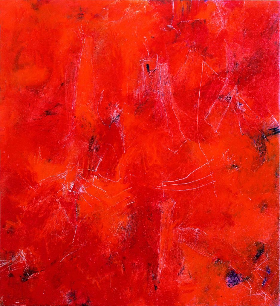
Segreti
olio su tela 130×120 1988
Punto 2.
Questo mio approccio fin dall’inizio chiaro nella creazione dell’opera mi ha condotto ad usare il colore con l’immediatezza del disegno, colore (meglio se ad olio) caratterizzato da una poliedricità materiale, fisica propria, ma lontano dalle precisioni insite nel disegno. Ciò non mi ha esonerato dal considerare il disegno classico come disciplina concettuale nella definizione dell’opera stessa.
In altre parole il disegno, tanto quanto il colore, avevano le stesse possibilità di senso: l’unica cosa che differenziava l’elemento principale del disegno -che è la linea-, dalla pittura -soprattutto colore-, è la sua caratteristica progettuale intrinseca.
Si sa che nella tradizione, nella formazione classica delle immagini il disegno viene prima a definire la forma che viene riempita dal colore in funzione della finalità rappresentativa del soggetto predato. Dettato, questo, classico appunto.
Aldilà di questa genesi, la linea ha una prerogativa: dimostrare ’prima’ qualcosa cui si accenna, laddove il colore si presenta meglio nella sua forza coinvolgente e meno nella sua specificità disegnativa.
Quindi linea e disegno si presentano con connotati e vincoli intrinseci, sono, l’uno già più progetto che non evidenza in sé -la linea-, l’altro più forza calamitante emozionale -il colore-.
Per me, all’inizio, la linea si è dimostrata elemento di maggior difficoltà all’uso per i miei fini.
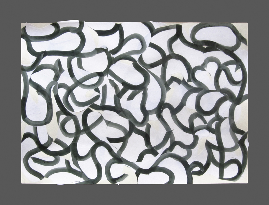
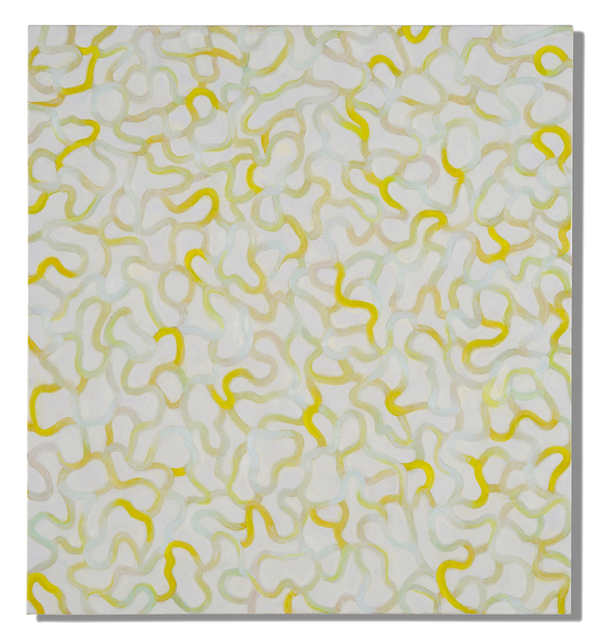
Così ho ripreso un lavoro specifico sulla linea circa quindici anni fa, con un bagaglio di esperienze importanti sulla materia pittorica, al fine di approfondire .
La relazione tra la linea e la forma che si sviluppa sul supporto è cruciale. Pertanto ho voluto ridurre al minimo gli aspetti descrittivi e progettuali della linea stessa. Utilizzando forme di supporto casuale, ho creato segni in equilibrio che ripartiscono spazi armonici.
L’automatismo nella creazione di spazi inaspettati pone le condizioni plastiche per mettere percettivamente alla prova le conformazioni più usate del nostro cervello secondo una dinamica probabilistica, più distributiva e meno definitoria, culturalmente più orientale e meno occidentale.
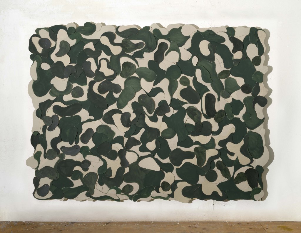
L’associazione del colore alla linea contribuisce a creare un’immagine che contrasta con gli automatismi della visione naturalistica che sono per lo più caratterizzati dalla familiarità della visione spaziale a noi connaturata e spontanea al fine di orientarci nel mondo. Le immagini da me ottenute si svincolano quindi da una sintassi classica che lega il disegno al colore al fine di ricostituire una visione illusiva del mondo. Le immagini da me ottenute aprono su spazi ed emotività inaspettate, sicuramente astratte-. Si torna all’Astrazione, ambito tradito dall’inizio di questi millennio, ma per me ancora foriero di novità, di un nuovo ‘autentico’ perché basato su fondamentali: segno e colore.
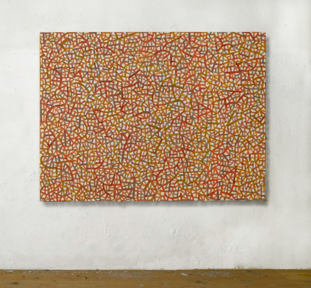
TUNDRA
olio su carta 150X200
2012-13
Olio su Carta 2011
Tundra
olio su carta 150×200
2012
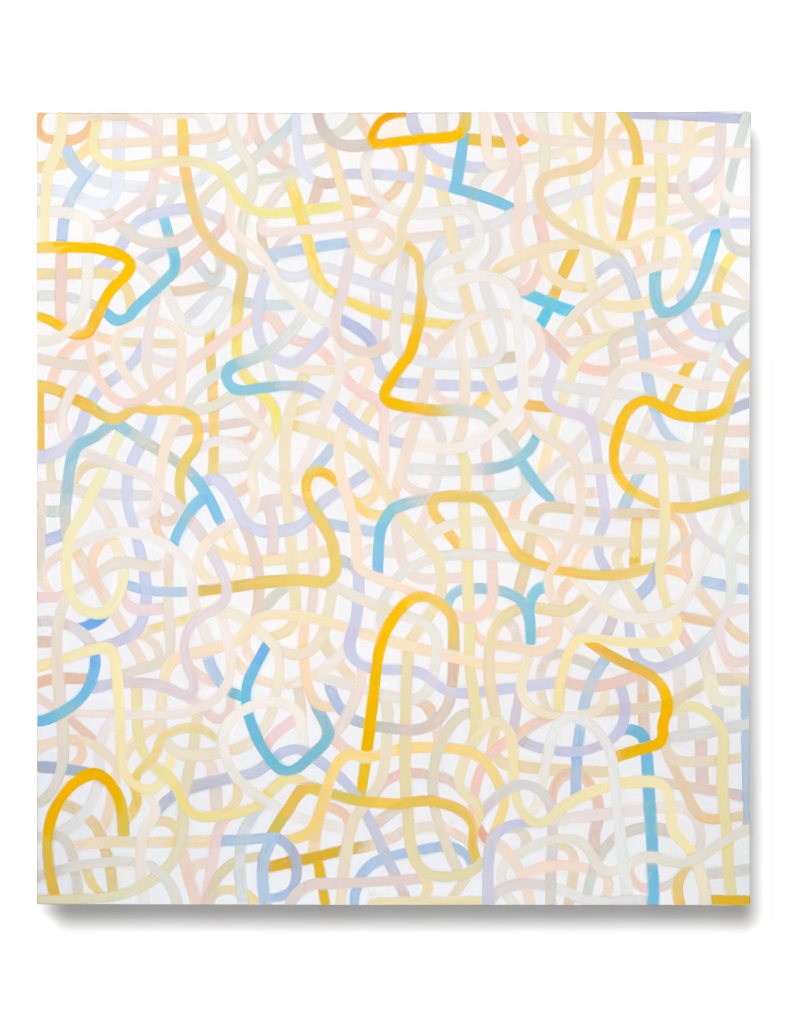
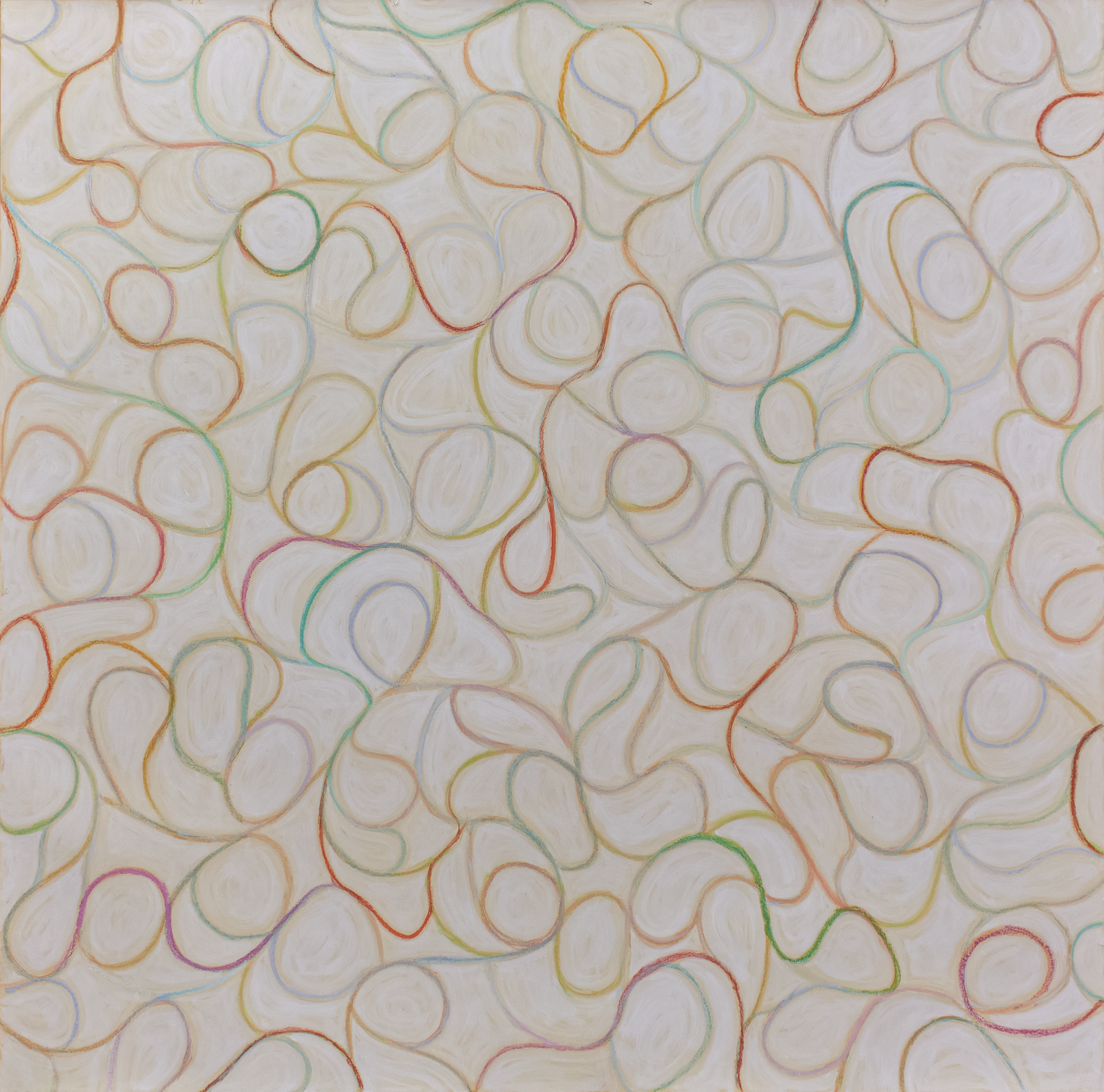
Punto 3.
Fin dall’inizio della mia carriera, credo di aver percorso l’astrazione dalle sue connotazioni più ‘astratte’ (Kandinsky, per intenderci) a quelle più ‘concrete’ (Mondrian, sempre per esemplificare), da immagini evanescenti e improbabili basate sul colore (che accenna ad un disegno degli anni ‘80), sono passato a costruire immagini improbabili basate sulla linea che è colore e disegno dei nostri giorni.
Ora, l’automatismo che disegno inizialmente, dal quale parto, consiste in un caos originale che vado ad ordinare con il colore, colore che sostanzia il disegno in una immagine definita, plastica, ma continuamente possibile allo sguardo secondo infinite probabilità, legate all’attimo dello sguardo in entrata permutante.
Quindi non una immagine fissa e data come quella conseguente all’impostazione classica, legata ad un soggetto da rappresentare secondo i canoni del visibile naturale, bensì una presenza metafisica capace di dar forma a soggetti probabili allo sguardo, ma variabili al momento dello sguardo, alla luce, alla qualità emotiva del riguardante.
Questo è quanto considero luogo di un Bello classico rinnovato: non dettato di racconti più o meno sacri messi in figura, bensì figura che apre alle molteplici emozioni da cui siamo costituiti in origine in ogni momento del nostro divenire, della nostra vita, pronti a cogliere in ogni attimo un concetto di Bello messo in forma, il lavoro realizzato. Classico e nuovo nella concezione.
Derivate
olio su tela 200×180
2020
Pensiero
olio su tela 150×145
2016
English text
On drawing Paolo Iacchetti
#paroladartista #disegno #drawnig #paoloiacchetti
Parola d’Artista:What importance and role does drawing play in your work?
Paolo Iacchetti: I reply in three points.
Point 1.
Drawing already. A lintel of traditional artistic work.
I believe that right from the start, it is necessary to consider that my career as an artist began at the time of a problematic vision of drawing in general, aggrevated in particular by a generational mismatch. However unrelated to a traditional view of the role of drawing.
It must also be said that, in lieu of a premise, what drew me to a career in art was the need to leave a ‘sign’: and this sign had to have the immediacy and freshness of the experience of the occurrence of presence, characteristics that are proper to drawing.
And indispensably, it could not be inscribed in a ‘I did this’ category, but had to have an objective character. In short, Fontana was in the air for me. But the experience that came closest to this idea of mine was abstract expressionism in its most radical forms, consisting of both Rothko and Pollock.
In Rothko, drawing is lost in the phenomenology of colour, in colour that becomes phenomenon.
And in Pollock it is the line that becomes phenomenology of the action of presence, that is, the denaturation of the line transformed into a continuum that becomes the phenomenon of presence.
From the outset I therefore decided to consider the image I formed as generated by an unrepeatable, unconditional immediacy, the result of artistic work. My encounter with the support was to constitute a sort of constructive dialogue of the image, unpredictable in its occurrence, where the element of an unthought-out action would remain as a founding character.
The results thus obtained allowed me to intervene again in a continuous succession until the image was concluded according to a found perceptual autonomy, subjectively decided but in function of an acceptable objectivity. Over time, certain criteria were defined to decide the end of the image definition process.
The criteria are both subjective, intuitive, synaesthetic, such as dynamic and perceptual balance and a metaphysical constructive autonomy of the image.
Elements that are apparently contradictory but not irreconcilable.
I believe that this characteristic of the image has remained in my work in recent times to guarantee to the work its own active presence to the eye, and at the same time a sublimating and furthering presence.
Point 2.
This clear approach of mine from the very beginning in the creation of the work has led me to use colour with the immediacy of drawing, colour (preferably oil) characterised by a material, physical versatility of its own, but far removed from the precision inherent in drawing. This did not exempt me from considering classical drawing as a conceptual discipline in the definition of the work itself.
In other words, drawing, as much as colour, had the same possibilities of meaning: the only thing that differentiated the main element of drawing -which is the line-, from painting -mainly colour-, was its intrinsic design characteristic.
It is known that in tradition, in the classical formation of images, drawing comes first to define the form that is filled by colour in function of the representative purpose of the predicate subject. Dictation, this, classical.n Exactly.
Beyond this genesis, line has a prerogative: to demonstrate ‘first’ something that is alluded to, where colour presents itself better in its involving force and less in its designating specificity.
Thus line and drawing present themselves with intrinsic connotations and constraints, one already more project than evidence in itself -the line-, the other more emotional magnetising force -the colour-.
For me, in the beginning, the line proved more difficult to use for my purposes.
So I resumed specific work on the line about fifteen years ago, with a wealth of important experience on the subject of painting, in order to deepen .
The relationship between the line and the form that develops on the support is crucial. Therefore, I wanted to minimise the descriptive and design aspects of the line itself. By using random support forms, I created signs in balance that distribute harmonious spaces.
The automatism in the creation of unexpected spaces sets the plastic conditions to perceptually test the most used conformations of our brain according to a probabilistic dynamic, more distributive and less defining, culturally more oriental and less western.
The association of colour with line contributes to creating an image that contrasts with the automatisms of naturalistic vision, which are mostly characterised by the familiarity of spatial vision innate to us and spontaneous in order to orient ourselves in the world. The images I obtain therefore break free from a classical syntax that binds drawing to colour in order to reconstitute an illusory vision of the world. The images I obtain open up unexpected, certainly abstract, spaces and emotions. We return to Abstraction, a field betrayed by the beginning of this millennium, but for me still a harbinger of novelty, of a new ‘authentic’ because it is based on fundamentals: sign and colour.
Point 3.
Since the beginning of my career, I believe I have travelled through abstraction from its more ‘abstract’ connotations (Kandiskian, to give us an example) to its more ‘concrete’ ones (Mondrian, again to give us an example), from evanescent and improbable images based on colour (which hints at a drawing from the 1980s), I have moved on to constructing improbable images based on the line that is colour and drawing in our day.
Now, the automatism that I draw initially, from which I start, consists of an original chaos that I go to order with colour, colour that substantiates the drawing in a definite image, plastic, but continuously possible to the gaze according to infinite probabilities, linked to the moment of the incoming, permuting gaze.
Therefore, not a fixed and given image like the one resulting from the classical approach, linked to a subject to be represented according to the canons of the natural visible, but rather a metaphysical presence capable of giving shape to subjects that are probable to the gaze, but variable according to the moment of the gaze, to the light, to the emotional quality of the subject.
This is what I consider to be the place of a renewed classical Beauty: not the dictation of more or less sacred tales put into a figure, but a figure that opens up to the multiple emotions from which we are originally constituted in every moment of our becoming, of our life, ready to grasp in every moment a concept of Beauty put into form, the work realised. Classic and new in conception.